Shopping Cart
There are no more items in your cart
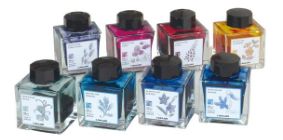


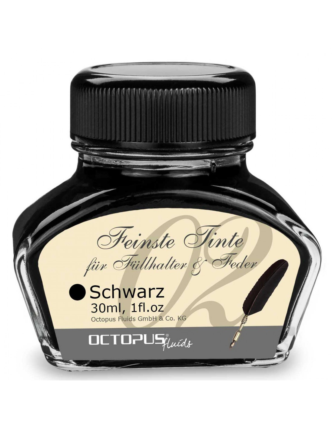
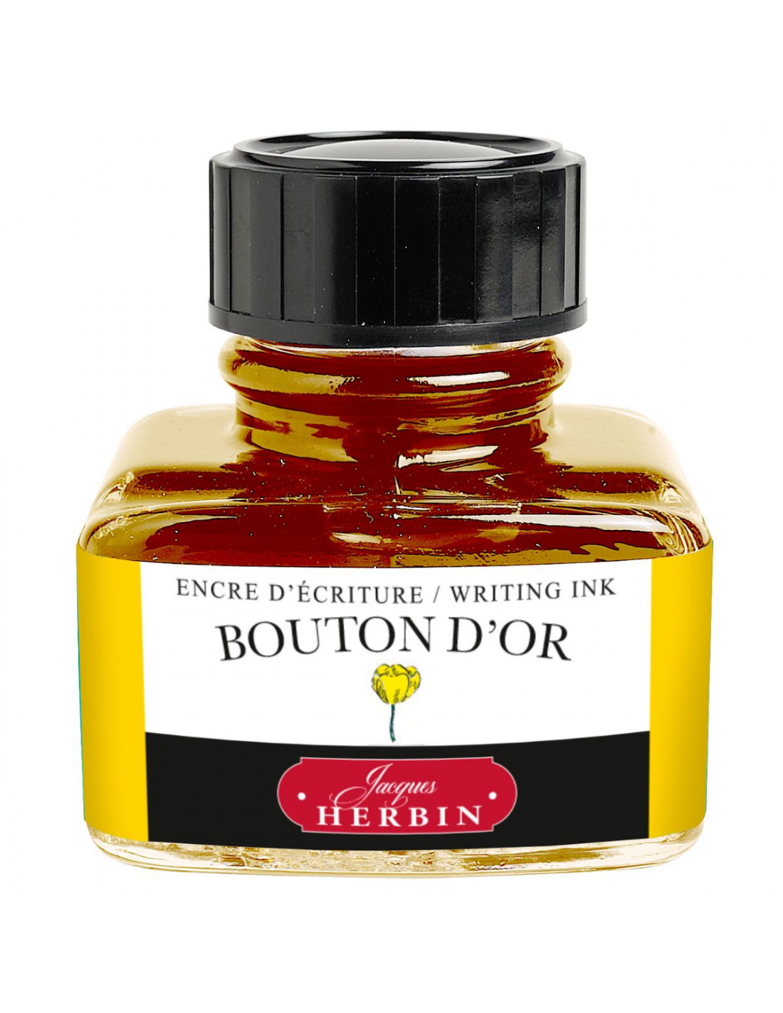
- On sale!
- -20%
In stock
€10.56 €13.20
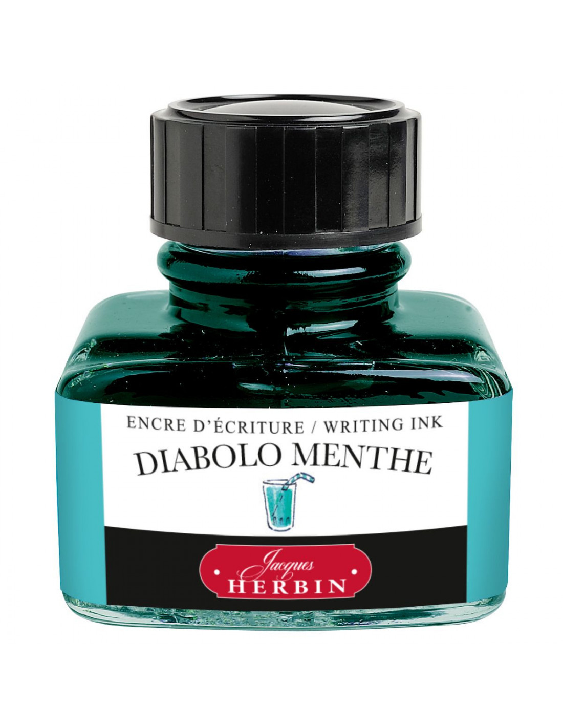
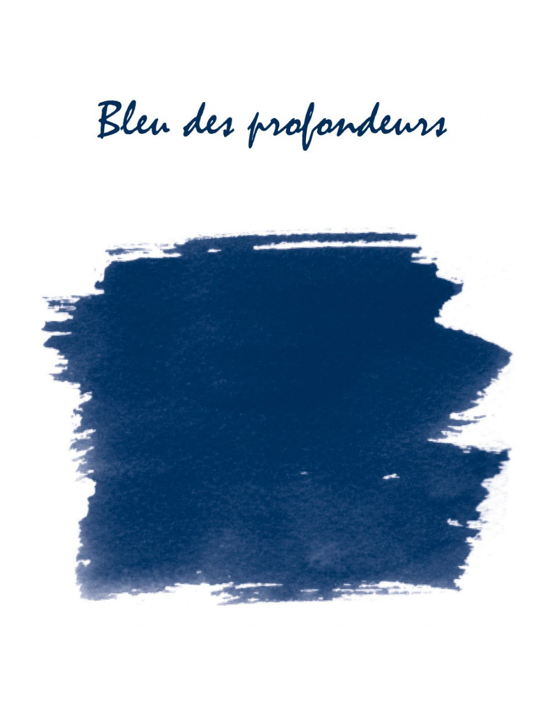
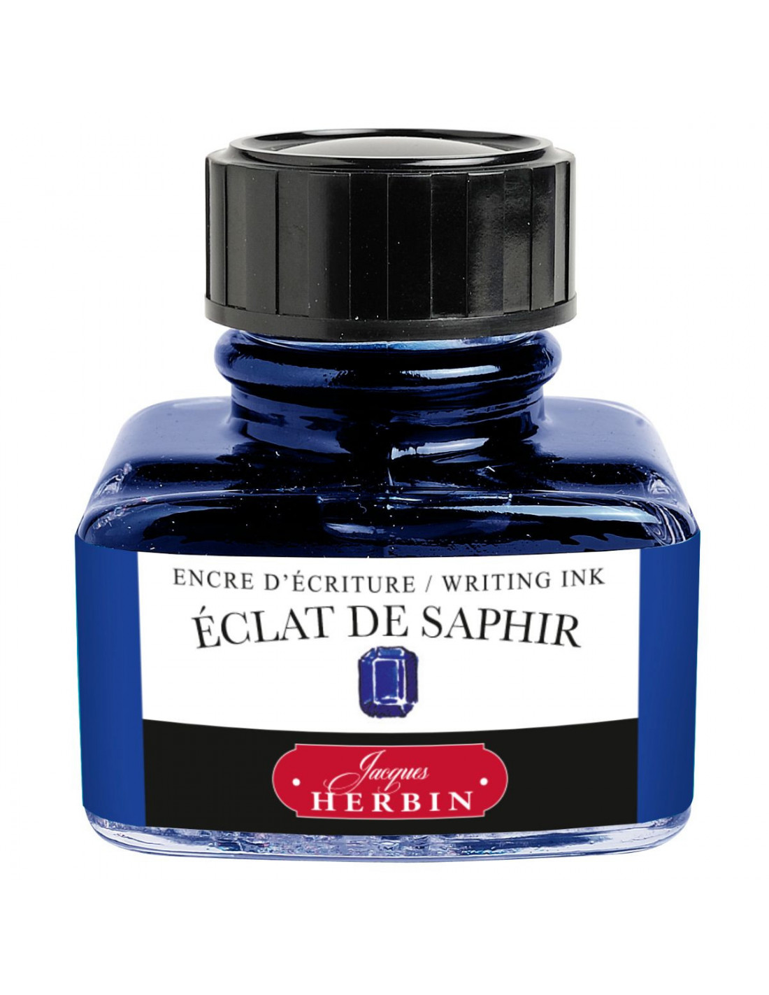
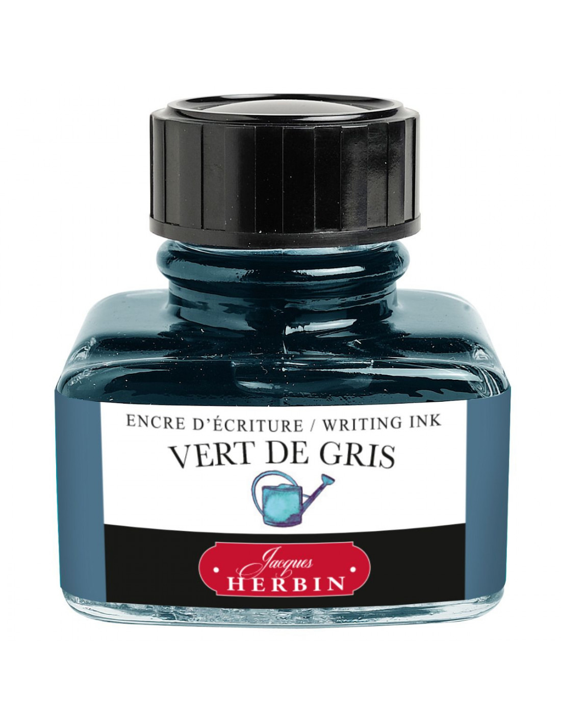
Exclusive german handmade ink for fountain pens.The ink is produced according to the requirements of EN71-3. 45ml bottle


WhatsApp with us