Shopping Cart
There are no more items in your cart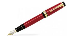


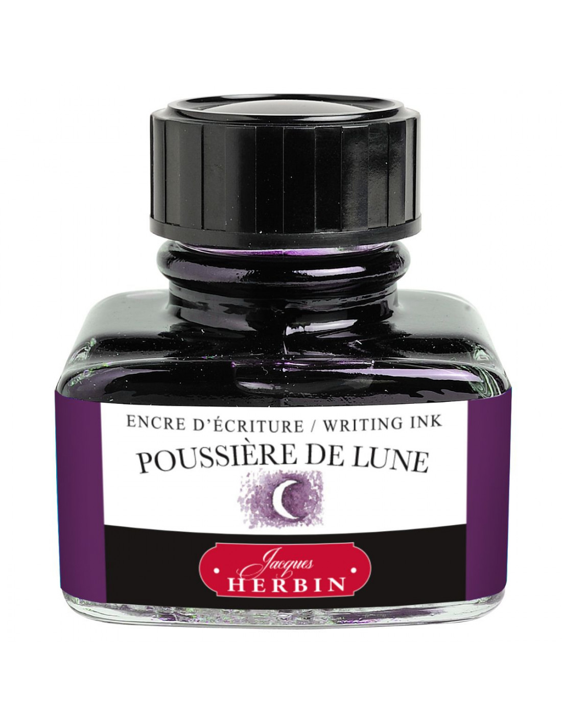
Out-of-Stock
€8.90
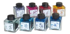
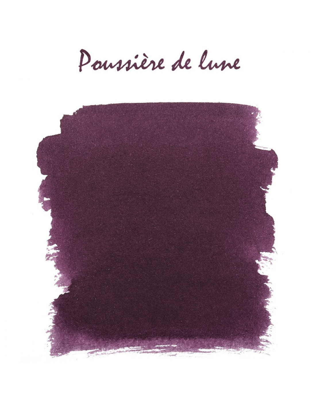
Poussière de Lune (Moon Dust): a very poetic name, the color of the night when only the crescent moon is glowing in the dark. Bottle 30 ml


WhatsApp with us